Airbnb and UX
Bad UX or bad user?
We use Airbnb and noticed a strange question from people willing to rent an apartment.
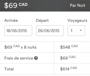
The tool is the calendar selection in this case.
Once you selected your arrival (arrivée) and your departure (départ) you should see the total. So even with this simple tool, new people keep asking the question how much it would cost !!!
So is it bad UX or bad user, I ask the question.
You can reply on our twitter account at https://twitter.com/lenomadecom

